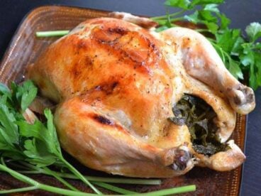
CoreUI Angular Logo
Framework:
  • JavaScript / Vanilla JS
  • React.js
  • Vue.js
Getting startedIntroductionSupport CoreUICustomizeSassOptionsCSS VariablesLayoutBreakpointsContainersGridColumnsGuttersFormsOverviewDate PickerPRODate Range PickerPROForm ControlSelectMulti SelectPROChecks & RadiosRangeRatingPROInput GroupFloating LabelsLayoutTime PickerPROValidationComponentsAccordionAlertAvatarBadgeBreadcrumbButtonButton GroupCalendarPROCalloutCardCarouselClose buttonCollapseDropdownFooterHeaderImageList GroupLoading ButtonPROModalNavNavbarOffcanvasPaginationPlaceholderPopoverProgressSmart PaginationPROSmart TablePROSidebarSpinnerTableTabsNewToastTooltipWidgetsIconsChartsTemplatesNewAdmin & DashboardDownloadInstallationCustomizeContentMigrationv4 → v5v3 → v4Angular version


DownloadHire UsGet CoreUI PRO
On this page
  • Overview
  • Examples
  • Basic
  • Translucent
  • Stacking
  • Custom content
  • Color schemes
  • Placement
  • API reference
  • Toast Module
  • c-toast
  • c-toast-body
  • c-toast-header
  • c-toaster
  • cToastClose

Angular Toast Component

Push notifications to your visitors with an Angular toast, a lightweight and easily customizable alert message.

Loading...

Angular toasts are lightweight notifications designed to mimic the push notifications that have been popularized by mobile and desktop operating systems. They’re built with flexbox, so they’re easy to align and position.

Overview

Things to know when using the toast plugin:

  • Toasts are opt-in for performance reasons, so you must initialize them yourself.
  • Toasts will automatically hide if you do not specify autohide: false.

Examples

Basic

To encourage extensible and predictable toasts, we recommend a header and body. Toast headers use display: flex, allowing easy alignment of content thanks to our margin and flexbox utilities.

Toasts are as flexible as you need and have very little required markup. At a minimum, we require a single element to contain your "toasted" content and strongly encourage a dismiss button.

Loading...
Loading...
Loading...
Loading...
Loading...
Loading...
Loading...
Loading...
Loading...
Loading...
Loading...
Loading...

Translucent

Toasts are slightly translucent to blend in with what's below them.

Loading...
Loading...

Stacking

You can stack toasts by wrapping them in a c-toaster container, which will vertically add some spacing.

Loading...
Loading...

Custom content

Customize your toasts by removing sub-components, tweaking them with utilities, or by adding your own markup. Here we've created a simpler toast by removing the default c-toast-header, adding a cButtonClose, and using some flexbox utilities to adjust the layout.

Loading...
Loading...

Alternatively, you can also add additional controls and components to toasts.

Loading...
Loading...

Color schemes

Building on the above example, you can create different toast color schemes with our color and background utilities. Here we've set color="primary" and added .text-white class to the c-toast, and then set white property to our close button. For a crisp edge, we remove the default border with .border-0.

Loading...
Loading...

Placement

Place toasts where need them to show. The top right or top middle is often used for notifications.

Loading...
Loading...

API reference

Toast Module

import { ToastModule } from '@coreui/angular';

@NgModule({
  imports: [ToastModule,]
})
export class AppModule() { }

c-toast

component

exportAs: cToast

Inputs
name description type default
autohide Auto hide the toast. boolean true
color Sets the color context of the component to one of CoreUI’s themed colors. Colors undefined
delay Delay hiding the toast (ms). number 5000
fade Apply fade transition to the toast. boolean true
visible Toggle the visibility of component. boolean false
Outputs
name description type
visibleChange Event emitted on visible change. boolean
timer Event emitted on clock tick (secs). number

c-toast-body

component

exportAs: cToastBody

c-toast-header

component

exportAs: cToastHeader

Inputs
name description type default
closeButton Add close button to the toast header. boolean true

c-toaster

component

exportAs: cToaster

Inputs
name description type default
placement Toaster placement. string top-end
position Toaster position. string | absolute | fixed | static absolute

cToastClose

directive

exportAs: cToastClose

Inputs
name description type default
cToastClose Toast to close. ToastComponent required
  • GitHub
  • Twitter
  • Support
  • CoreUI (Vanilla)
  • CoreUI for React.js
  • CoreUI for Vue.js

CoreUI for Angular is Open Source UI Components Library for Angular.

Currently v5.2.23 Code licensed MIT , docs CC BY 3.0 .
CoreUI PRO requires a commercial license.