Pulled Shredded Chicken
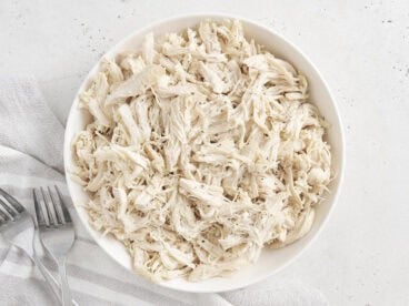
$8.43 recipe / $1.05 servingThis easy shredded chicken recipe makes moist, tender chicken that's perfect for meal prep, quick dinners, or adding to your favorite weeknight meals.
This easy shredded chicken recipe makes moist, tender chicken that's perfect for meal prep, quick dinners, or adding to your favorite weeknight meals.

These Baked Chicken Chimichangas are full of seasoned chicken, refried beans, tomato sauce, and melty cheese. Baked, not fried, for a crispy, golden finish without the mess!

This easy recipe for Creamy Pork Chops is made with mushrooms, spinach, and a rich pan sauce. It's a quick dinner the whole family will love!

Sopa de Fideo is an incredibly simple yet flavorful soup made with a tomato based broth, toasted vermicelli noodles, fresh lime, and cilantro.

Creamy, cheesy, and packed with broccoli, this one pot Broccoli Cheddar Orzo is a quick and cozy weeknight favorite that comes together in under 30 minutes.

The slow cooker does all the work with this easy and healthy crockpot white chicken chili. This "dump and go" dinner will become a family favorite!

Zuppa Toscana is a creamy, filling, and flavorful soup with Italian sausage, potatoes, and kale. Just like The Olive Garden's, but made from scratch!

This creamy Marry Me Chicken is full of flavor from sun-dried tomatoes, garlic, and Parmesan. Easy enough for weeknights, but fancy enough for date night!

This hearty chicken and vegetable Stone Soup is inspired by the classic folk tale. It's made with simple ingredients and is perfect for the whole family!
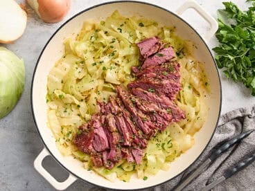
This tender, flavorful Corned Beef and Cabbage recipe is a budget-friendly family favorite! Perfect for St. Patrick’s Day or a cozy dinner!

This creamy White Chicken Chili is fast, easy, and extra cozy for those cold fall and winter nights. The leftovers are great, too!

This easy Brunswick Stew recipe is made with simple ingredients and packed with delicious flavor. A classic that's perfect for family dinners or meal prep!