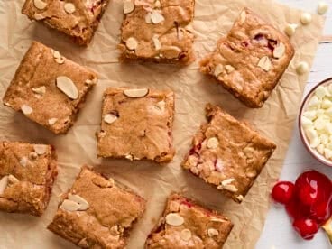
Framework:
  • JavaScript / Vanilla JS
  • React.js
  • Vue.js
On this page

Loading...
Navigation available in CoreUI for Angular share general markup and styles, from the base `.nav` class to the active and disabled states. Swap modifier classes to switch between each style. ## Examples The base `c-nav` component is built with flexbox and provide a strong foundation for building all types of navigation components. It includes some style overrides (for working with lists), some link padding for larger hit areas, and basic disabled styling. ### Base nav
Classes are used throughout, so your markup can be super flexible. Use `c-nav-item` like above, or roll your own with a `c-nav` element. Because the `.nav` uses `display: flex`, the `cNavLink` behaves the same as `c-nav-item` would, but without the extra markup.
Change the style of `c-nav` component with modifiers and utilities. Mix and match as needed, or build your own. ### Horizontal alignment Change the horizontal alignment of your nav with flexbox utilities. By default, navs are left-aligned, but you can easily change them to center or right aligned. Centered with `.justify-content-center`:
Right-aligned with `.justify-content-end`:
### Vertical Stack your navigation by changing the flex item direction with the `.flex-column` utility. Need to stack them on some viewports but not others? Use the responsive versions (ex. `.flex-sm-column`).
### Tabs Take the basic nav from above and add the `variant="tabs"` class to generate a tabbed interface
### Pills Take that same HTML, but use `variant="pills"` instead:
### Underline PRO Take that same HTML, but use `variant`="underline":
### Fill and justify Force your `c-nav` contents to extend the full available width one of two modifier classes. To proportionately fill all available space with your `c-nav-item`, use `layout="fill"`. Notice that all horizontal space is occupied, but not every nav item has the same width.
For equal-width elements, `use layout="justified"`. All horizontal space will be occupied by nav links, but unlike the `fill` above, every nav item will be the same width.
### Working with flex utilities If you need responsive nav variations, consider using a series of [flexbox utilities](https://coreui.io/docs/utilities/flex). While more verbose, these utilities offer greater customization across responsive breakpoints. In the example below, our nav will be stacked on the lowest breakpoint, then adapt to a horizontal layout that fills the available width starting from the small breakpoint.
### Using dropdowns Add dropdown menus with a little extra HTML.
### Tabs with dropdowns
### Pills with dropdowns
--- ## Regarding accessibility If you're using navs to provide a navigation bar, be sure to add a `role="navigation"` to the most logical parent container of the `c-nav`, or wrap a `nav` element around the whole navigation. Do not add the role to the `c-nav` itself, as this would prevent it from being announced as an actual list by assistive technologies. Note that navigation bars, even if visually styled as tabs with the `.nav-tabs` class, should not be given `role="tablist"`, `role="tab"` or `role="tabpanel"` attributes. These are only appropriate for dynamic tabbed interfaces, as described in the WAI ARIA Authoring Practices. See JavaScript behavior for dynamic tabbed interfaces in this section for an example. The `aria-current` attribute is not necessary on dynamic tabbed interfaces since our JavaScript handles the selected state by adding `aria-selected="true"` on the active tab.
| name | description | type | default | | ---- | ----------- | ---- | ------- | | `layout` | Specify a layout type for component. | `fill` \| `justified` | _undefined_ | | `variant` | Set the nav variant to tabs or pills. | `tabs` \| `pills` \| `underline` |_undefined_|
### c-nav-item _component_ ### cNavLink _directive_ ##### Inputs
| name | description | type | default | | ---- | ----------- | ---- | ------- | | `active` | Toggle the active state for the host link. | `boolean` | _undefined_ | | `disabled` | Set disabled attr for the host element. | `boolean` |_false_|
  • GitHub
  • Twitter
  • Support
  • CoreUI (Vanilla)
  • CoreUI for React.js
  • CoreUI for Vue.js

CoreUI for Angular is Open Source UI Components Library for Angular.

Currently v5.2.23 Code licensed MIT , docs CC BY 3.0 .
CoreUI PRO requires a commercial license.