Classic Three Bean Salad
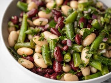
$3.84 recipe / $0.77 servingJust a few simple ingredients come together in this Classic Three Bean Salad to make an easy summer side dish, perfect for BBQs and potlucks!
Just a few simple ingredients come together in this Classic Three Bean Salad to make an easy summer side dish, perfect for BBQs and potlucks!
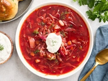
This easy Ukrainian Borscht recipe is made with canned beets, plenty of veggies, fresh herbs, and vinegar to create a tangy, earthy, and delicious soup!

This creamy White Chicken Chili is fast, easy, and extra cozy for those cold fall and winter nights. The leftovers are great, too!

You won't miss the chickpeas in this protein-packed white bean hummus! It's creamy, flavorful, and so easy to make at home.

Shrimp and white bean stew is a one-pot wonder packed with protein and bursting with flavor. It's super filling, delicious, and easy to make!

This Chicken Sausage White Bean Skillet is a quick & easy one-skillet meal that’s filling, budget-friendly and delicious!
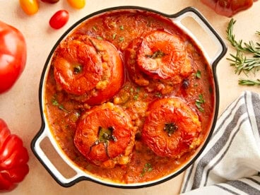
This Tuscan White Bean Stuffed Tomatoes recipe is hearty, warming, and deeply satisfying. It's also budget-friendly and easy to make!

These Buffalo beans and greens are a little bowl of luxury on a shoestring budget. We just can't get enough!

Parmesan and freshly cracked pepper give these canned cannelini beans new life! These Parmesan beans are an easy and delicious side dish.
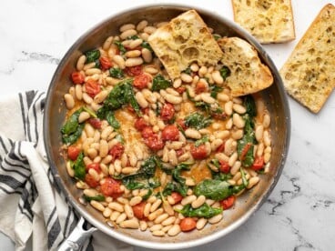
Saucy white beans with spinach is an easy and filling meal made with canned beans that you can throw together on a busy weeknight.
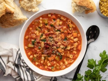
Pasta e Fagioli is a classic, budget-friendly Italian soup that combines beans, pasta, vegetables, and a flavorful tomato-based broth.

Wilted spinach salad with bacon, white beans, and a tangy Dijon vinaigrette is a quick, easy, and light summer meal.