
Bruschetta
$8.63 recipe / $1.07 servingThis easy Bruschetta recipe is a delicious and budget-friendly appetizer made with fresh tomatoes, basil, garlic, and a crunchy baguette base.
This easy Bruschetta recipe is a delicious and budget-friendly appetizer made with fresh tomatoes, basil, garlic, and a crunchy baguette base.

Bún chả (Vietnamese Meatballs) are simple, light, fresh, and perfect for a hot summer day or as a make-ahead meal.
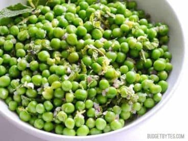
Mint and a fresh lemon and shallot vinaigrette turn a simple bag of peas into an elegant Minty Pea Salad. Pairs perfectly with a spicy main dish.