
Baked Chicken Chimichangas
$11.21 recipe / $2.80 servingThese Baked Chicken Chimichangas are full of seasoned chicken, refried beans, tomato sauce, and melty cheese. Baked, not fried, for a crispy, golden finish without the mess!
These Baked Chicken Chimichangas are full of seasoned chicken, refried beans, tomato sauce, and melty cheese. Baked, not fried, for a crispy, golden finish without the mess!
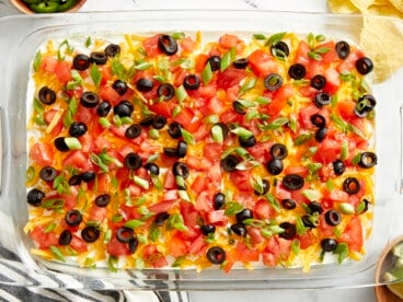
This easy 7 Layer Dip is the perfect appetizer for parties, football games, and gatherings. No cooking needed and it feeds a large crowd!

These easy Bean and Cheese Enchiladas are anything but boring. A few extra details take them from a simple to spectacular weeknight dinner.